

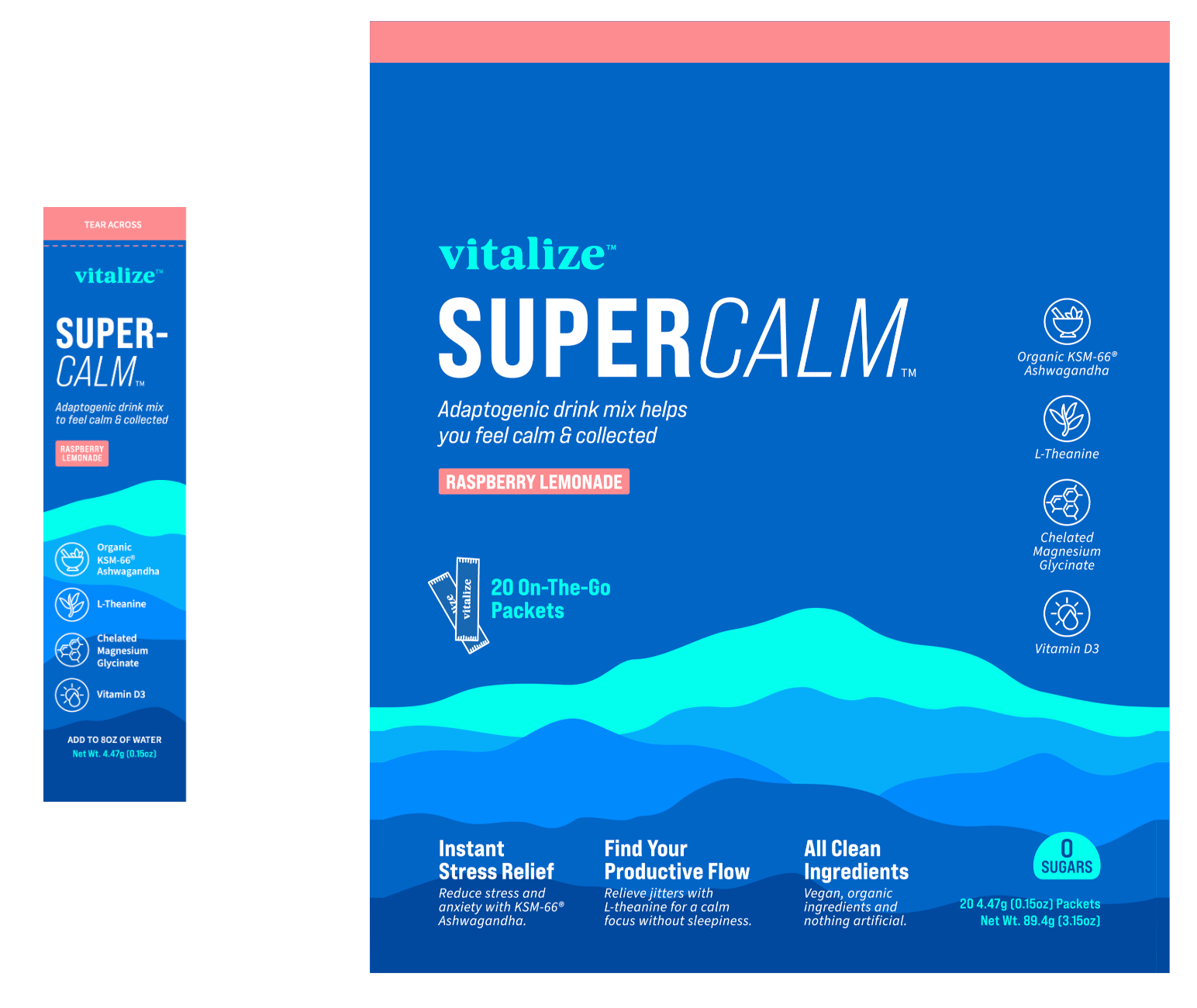
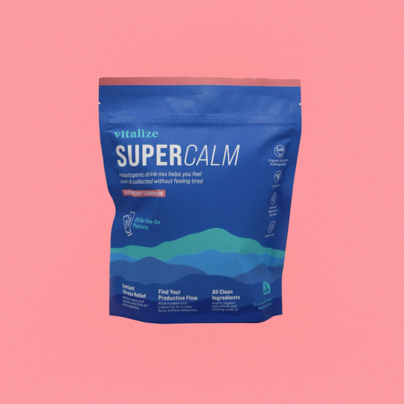
Vitalize™ believes good health means feeling more like yourself, and that supplements should enhance one's natural state of being. They are passionate about educating others about how the balance of the right clean ingredients can fight against daily stress-without negative side effects. This is made possible with their delicious & refreshing drink mix, SuperCalm™. The mission? To create a brand identity that evokes marketplace expertise while also encapsulating relaxed positivity, sunshine energy, and cool focus.
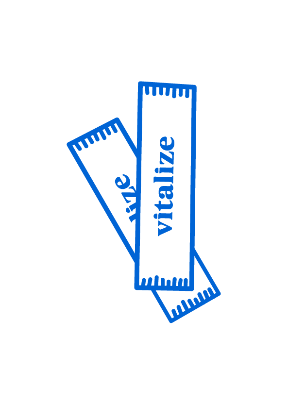
The logotype is defined by sophistication and steadiness in the boldness and consistency of the typography, while simultaneously imparting a friendly and calm tone. This marriage between sobriety and coolness is perfectly balanced throughout the lines and curves of the letterforms. The dots of the i's resemble the soft semi-circle of the rising and setting sun, which reflects how Vitalize™ is the perfect way to start or end the day.
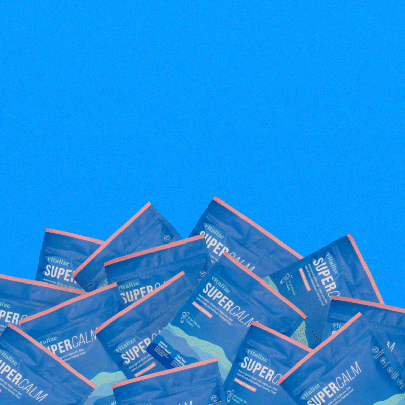
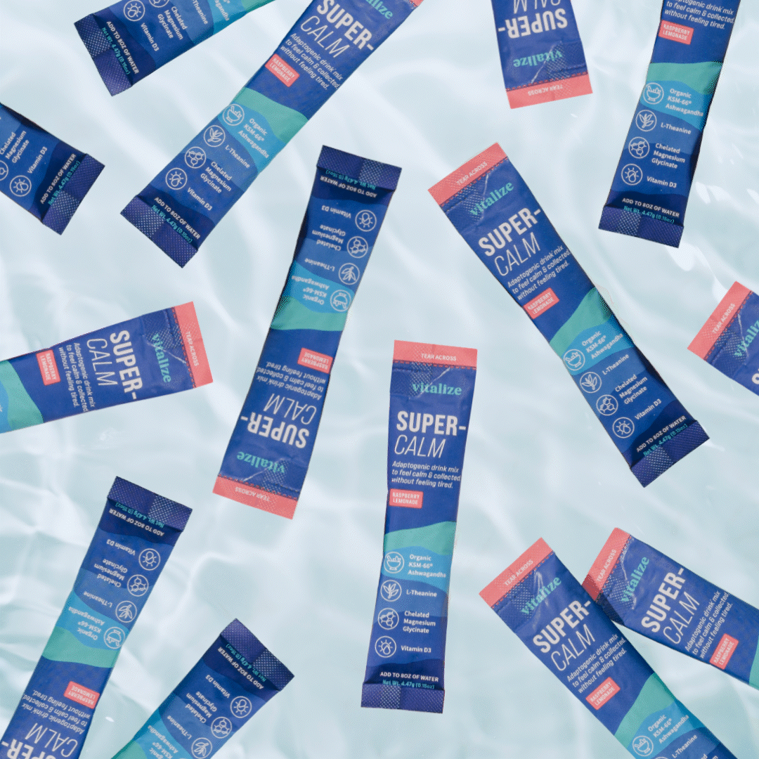
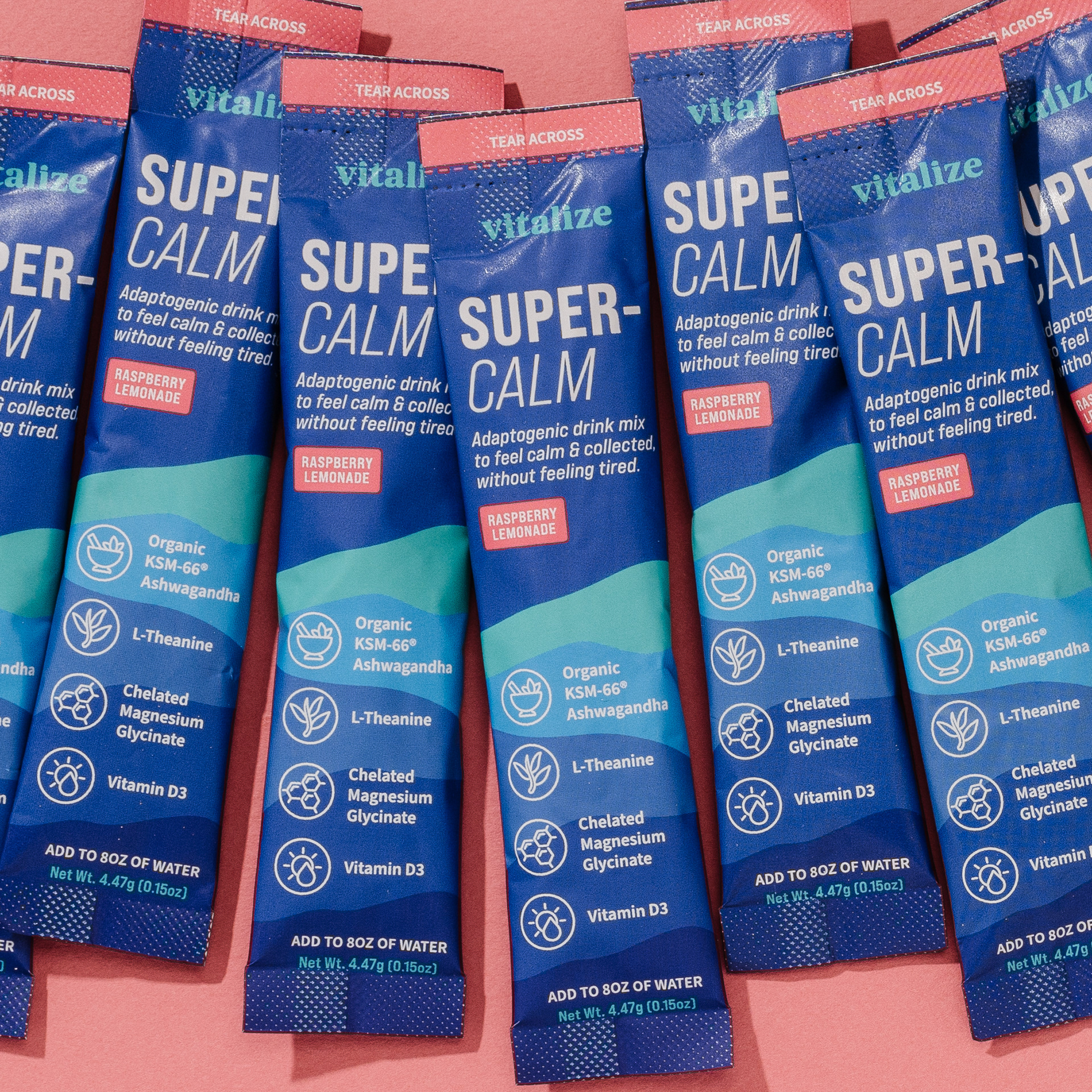
Labels Flat Lay
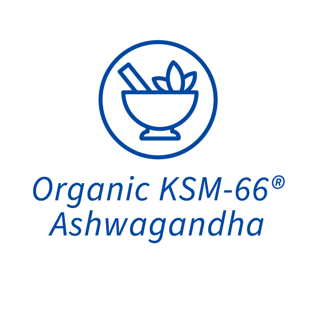
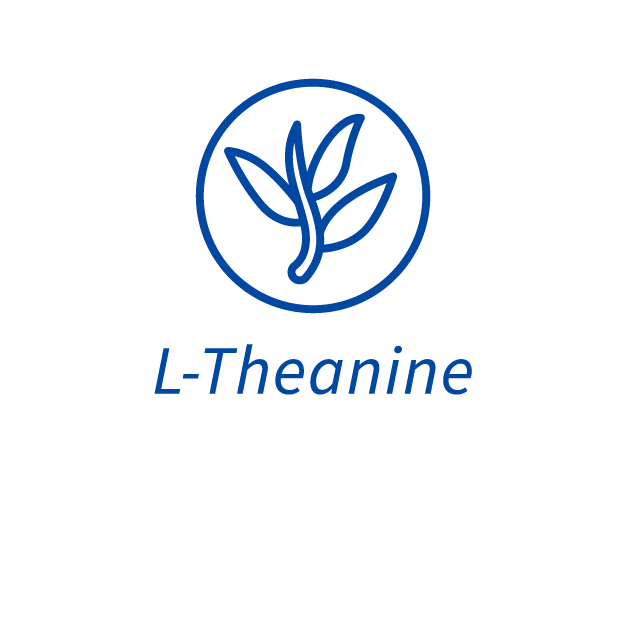
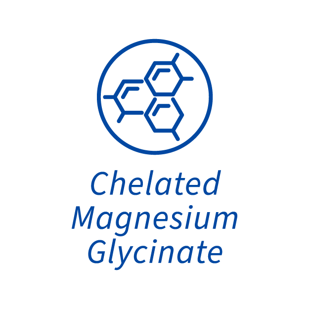
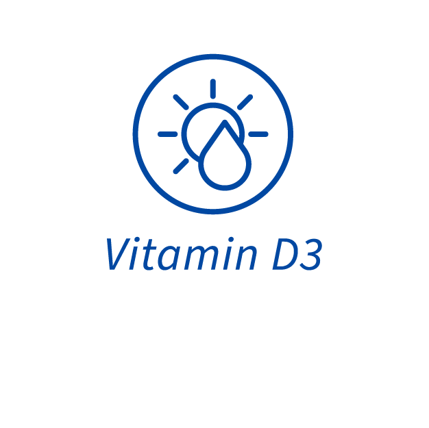
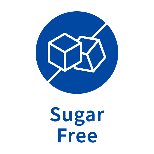
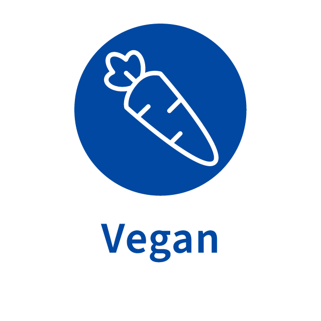
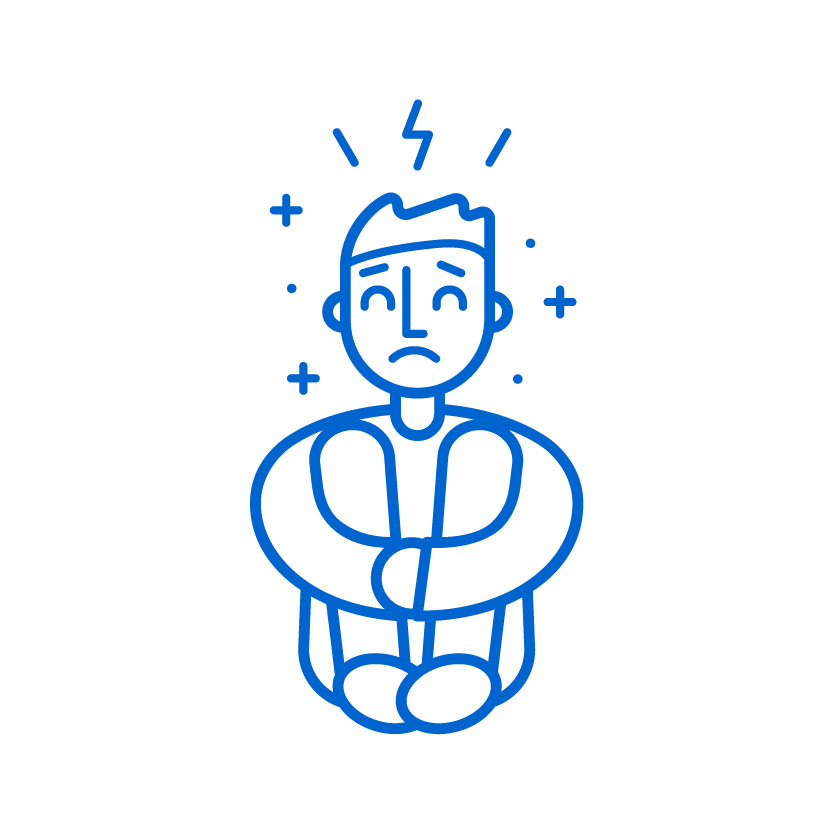
Custom Icons


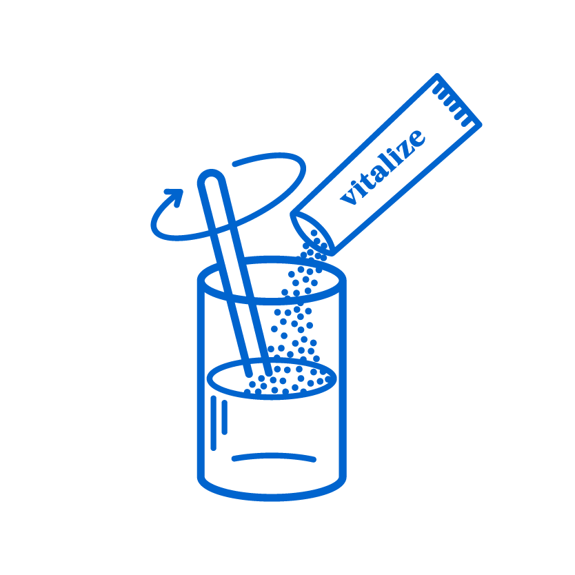
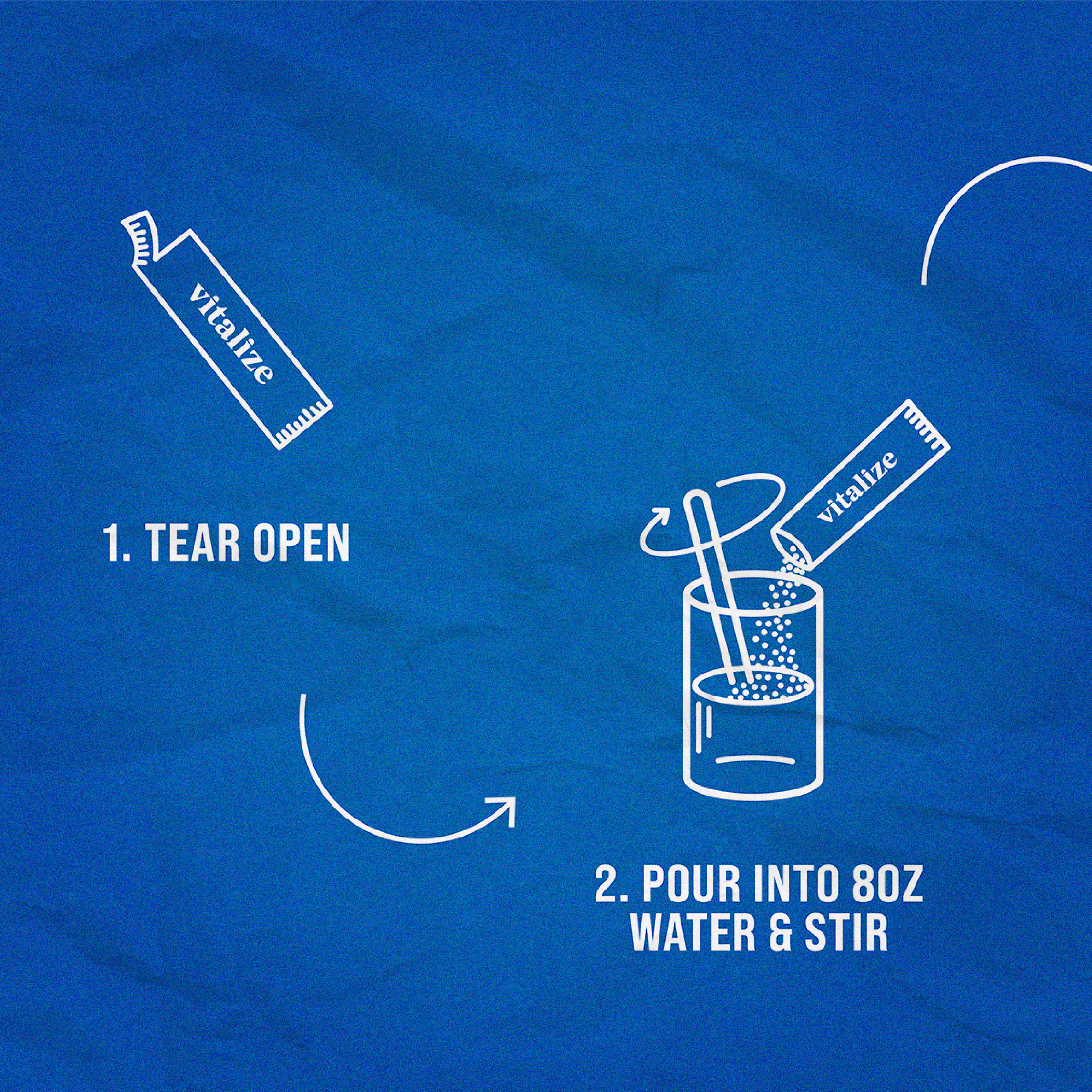
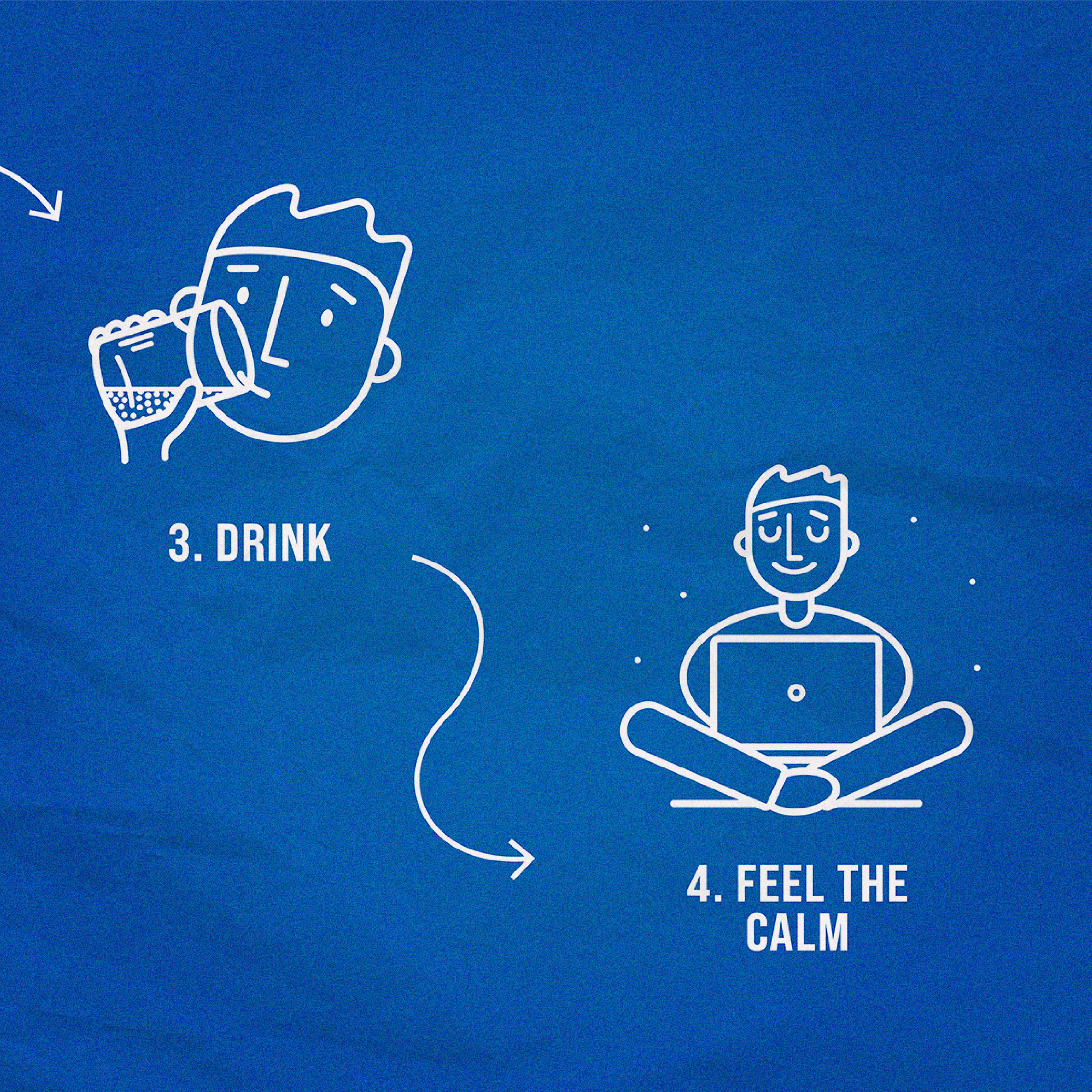
Custom Instructional Illustrations


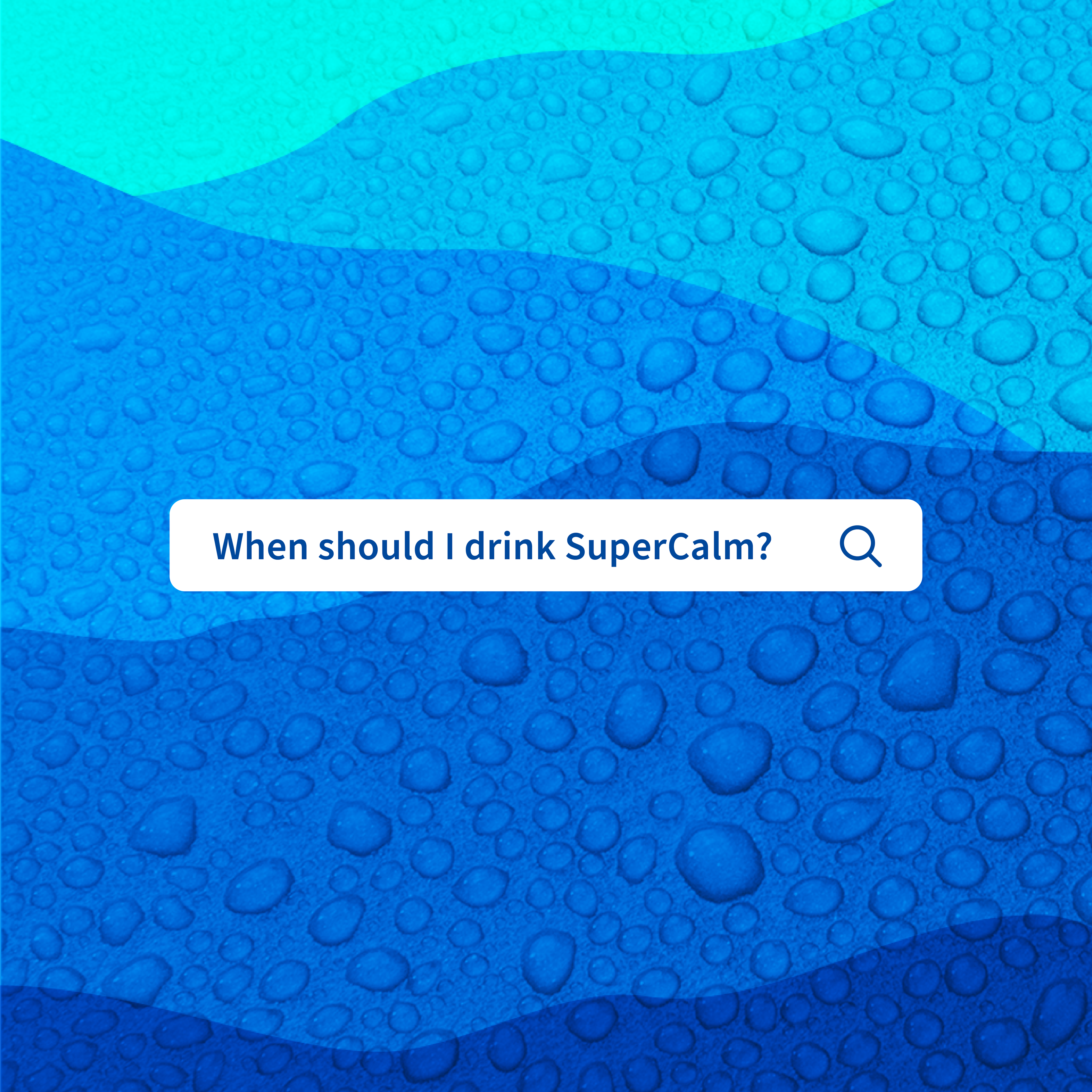
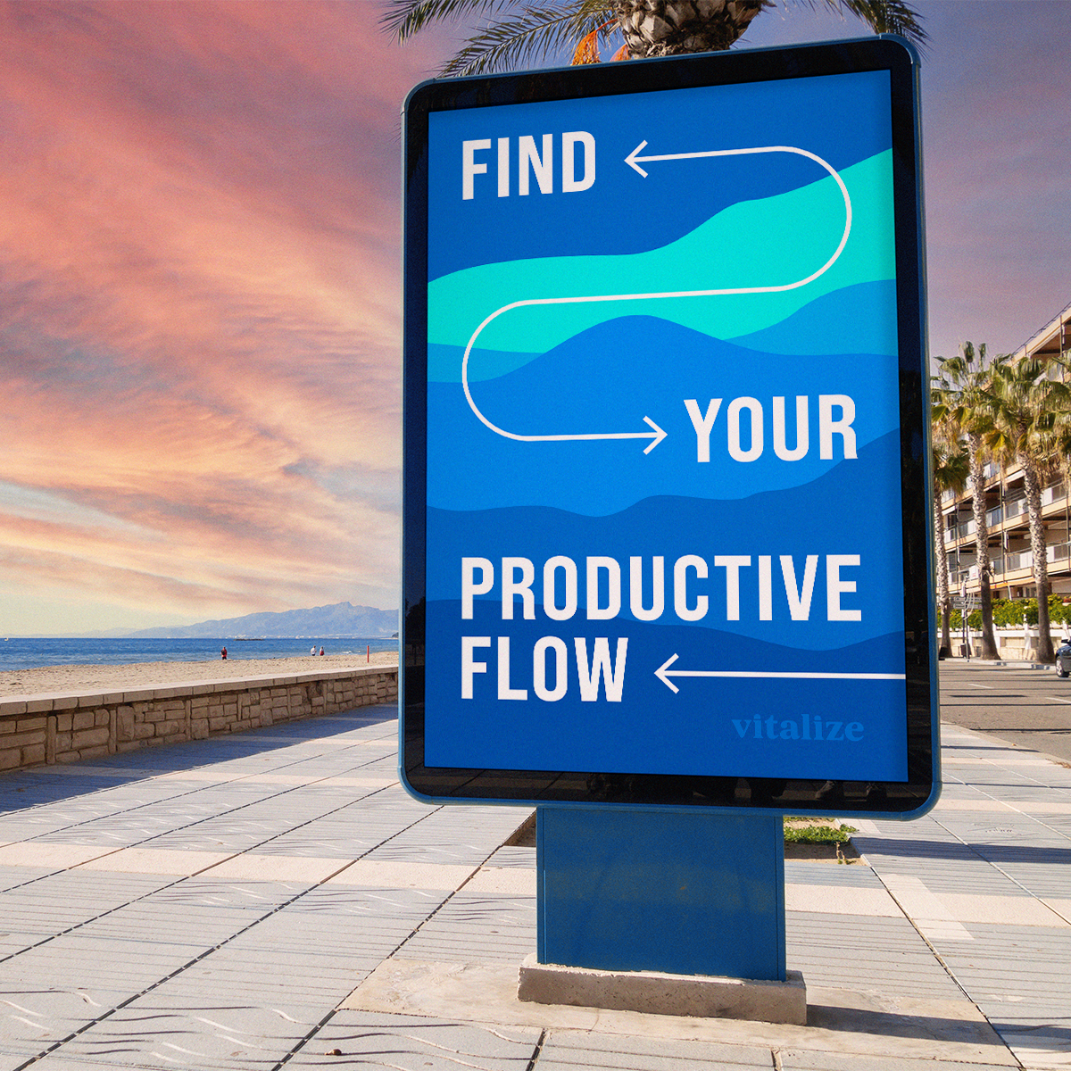
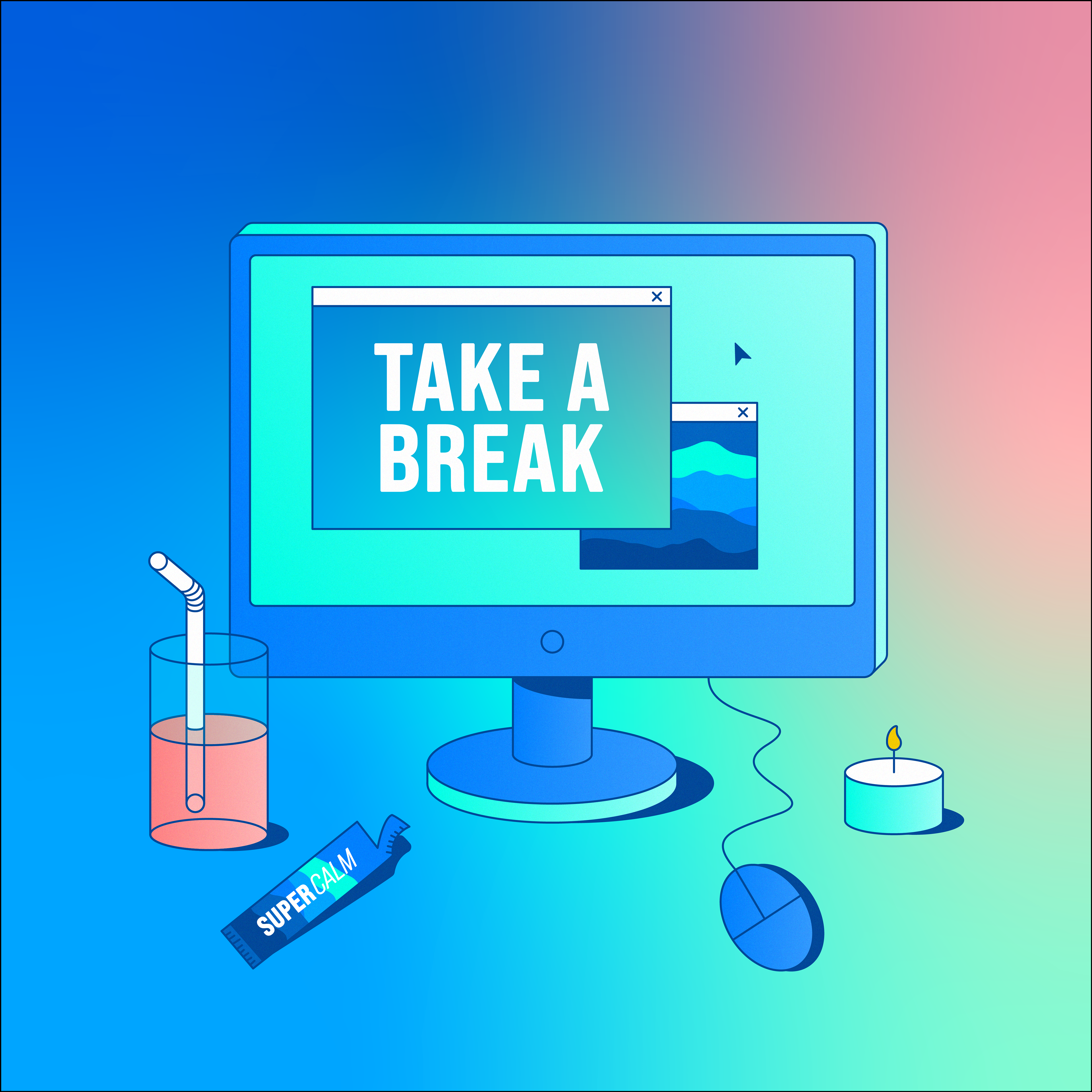
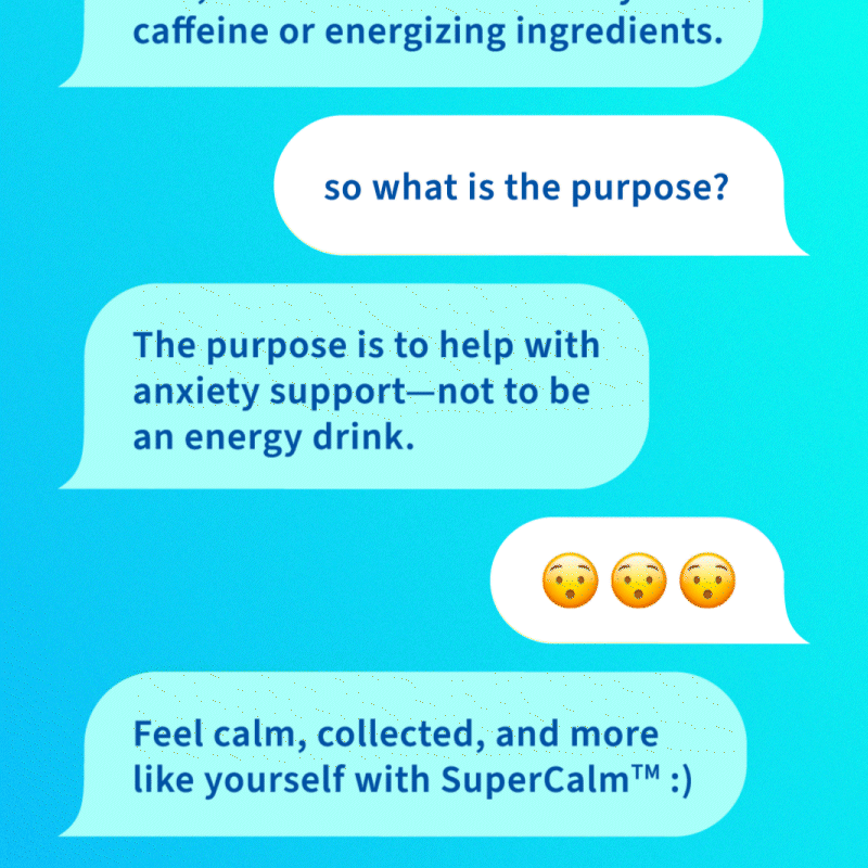
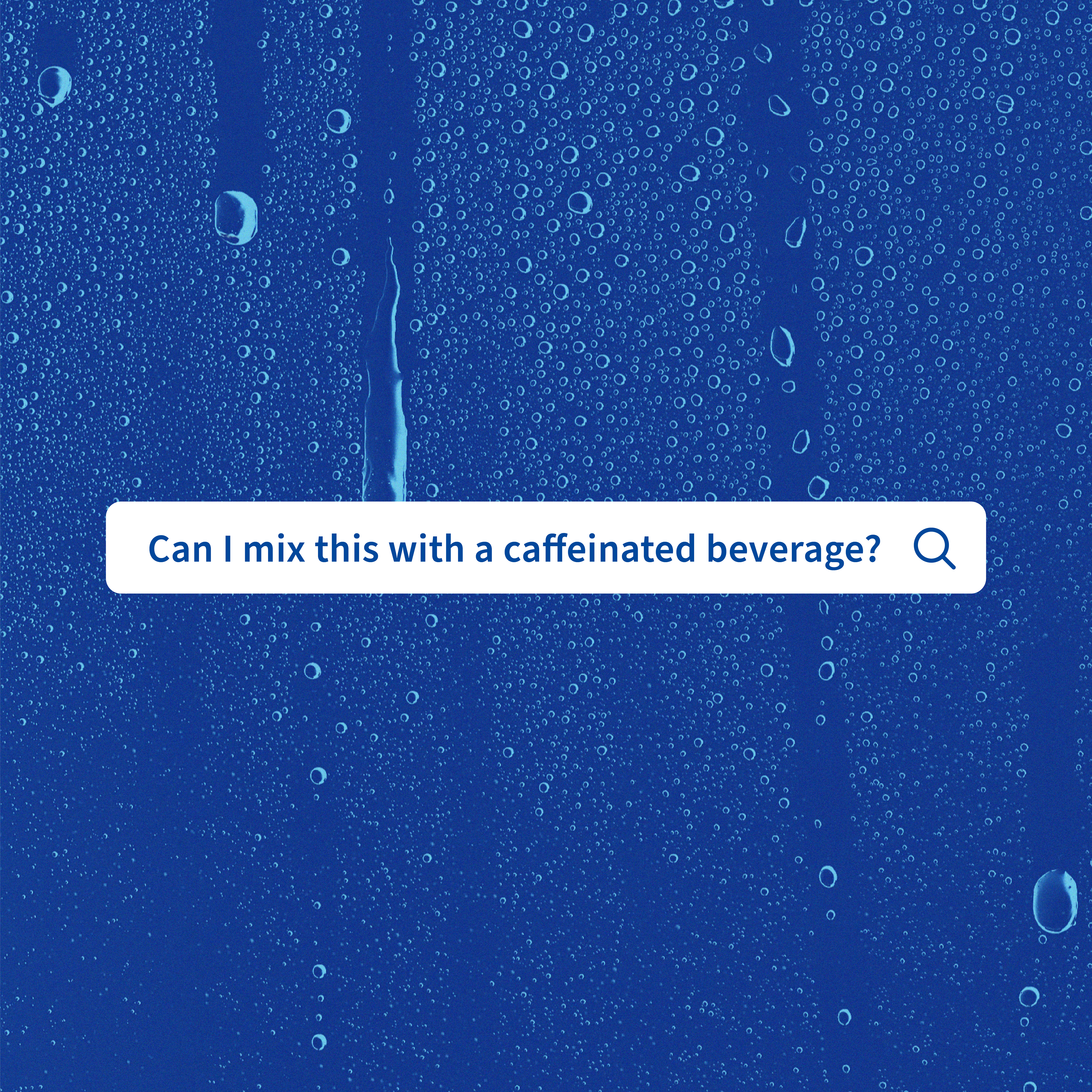
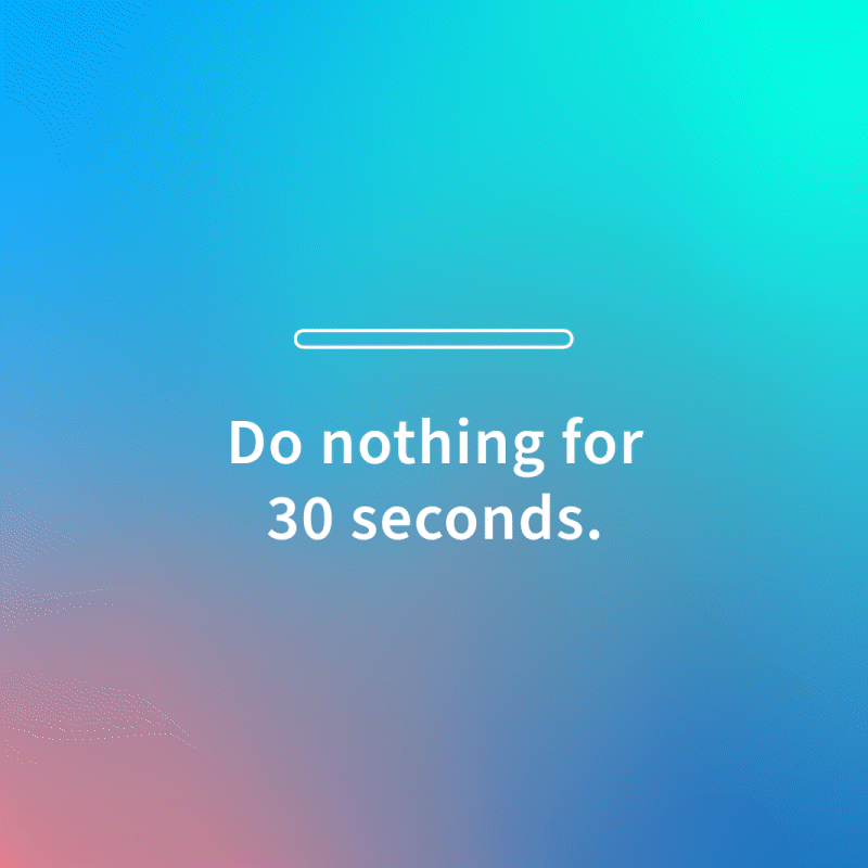
Feed Design / Social Graphics

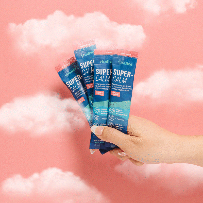
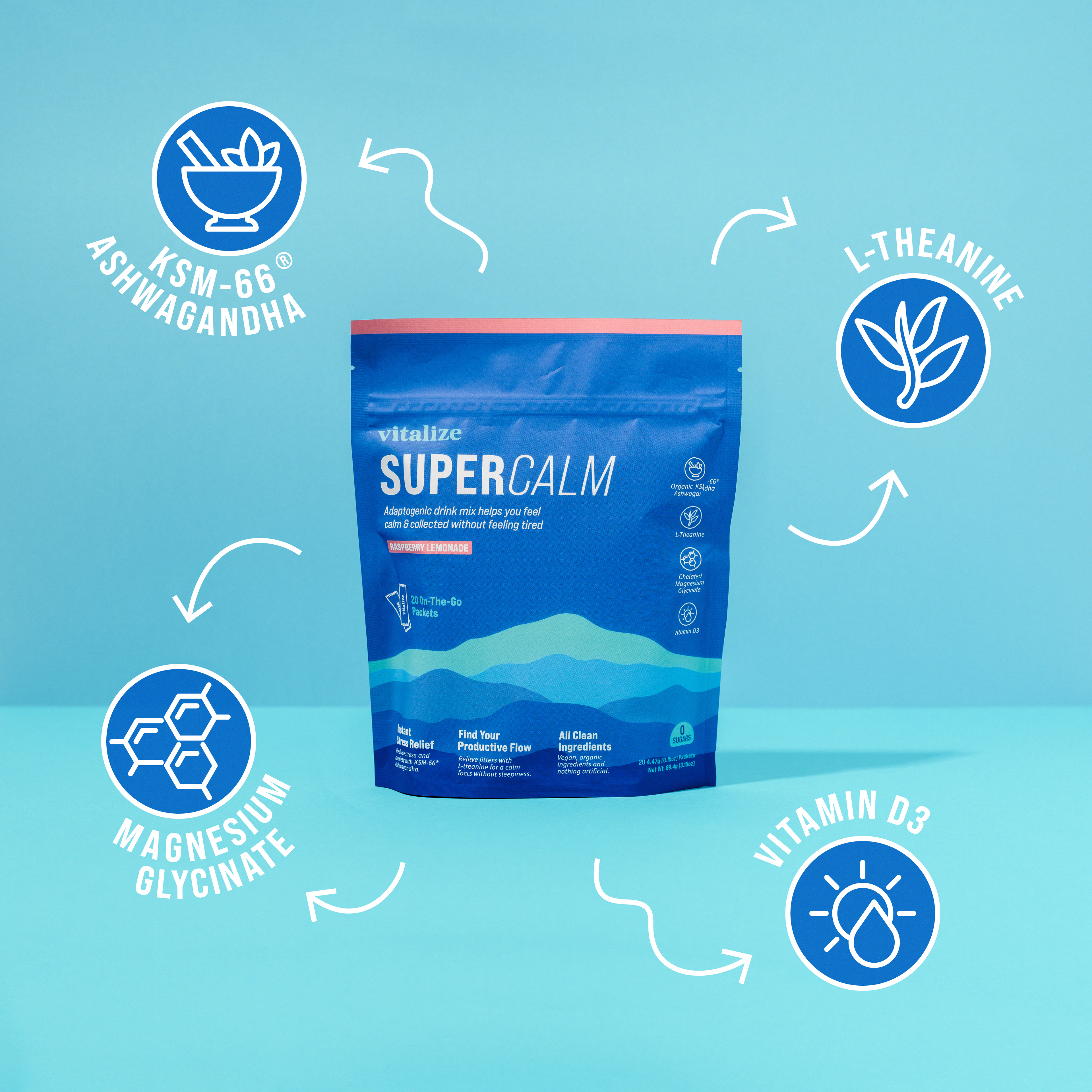
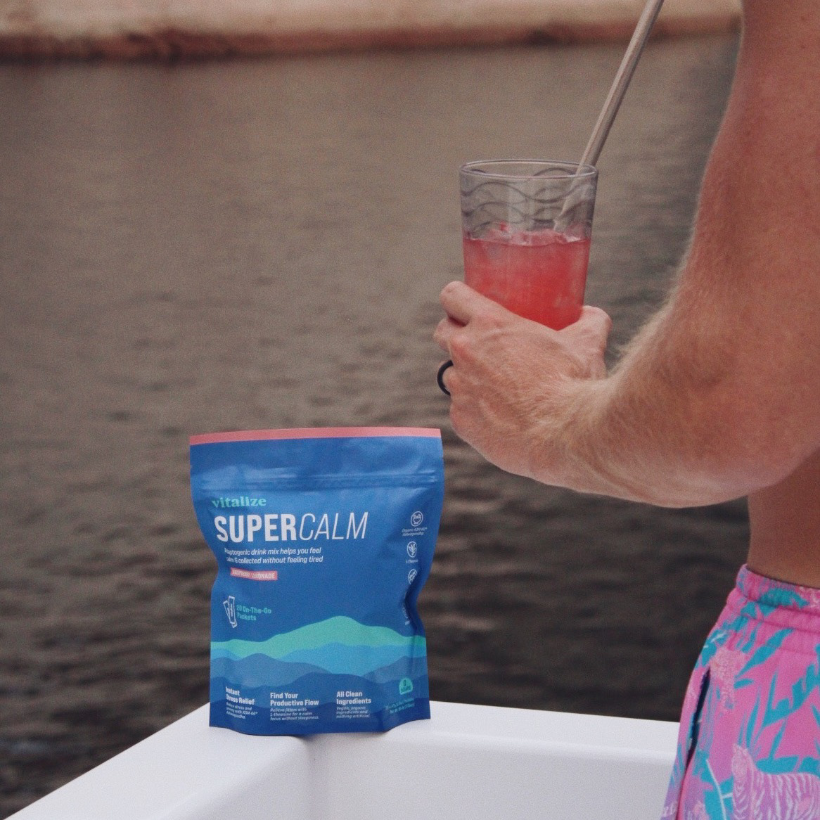
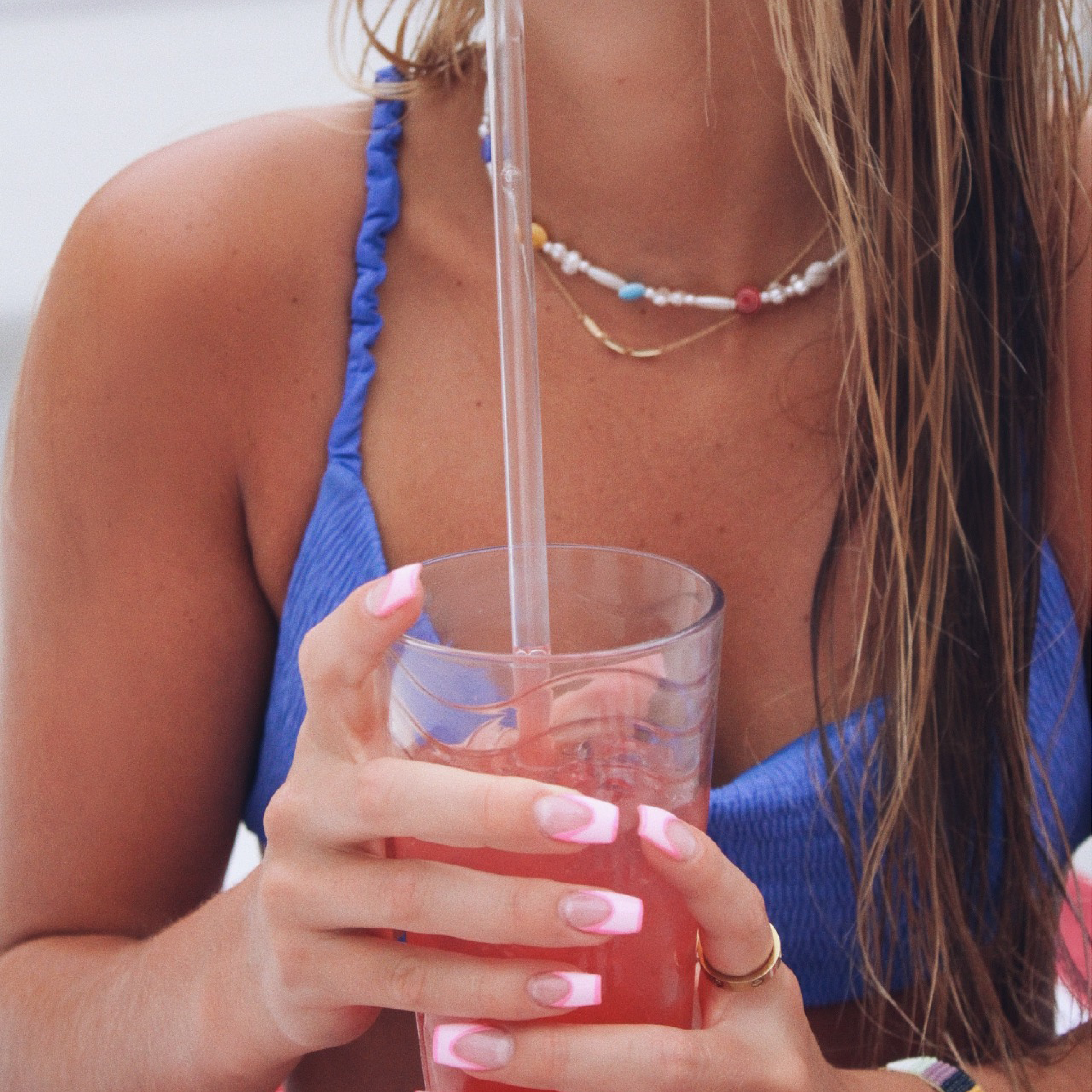
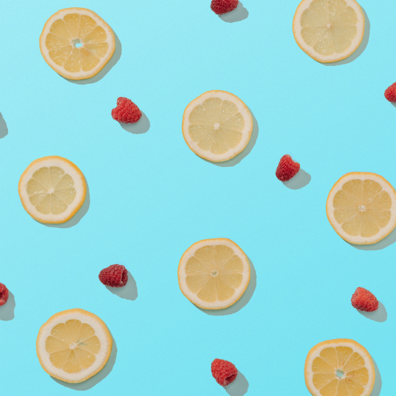

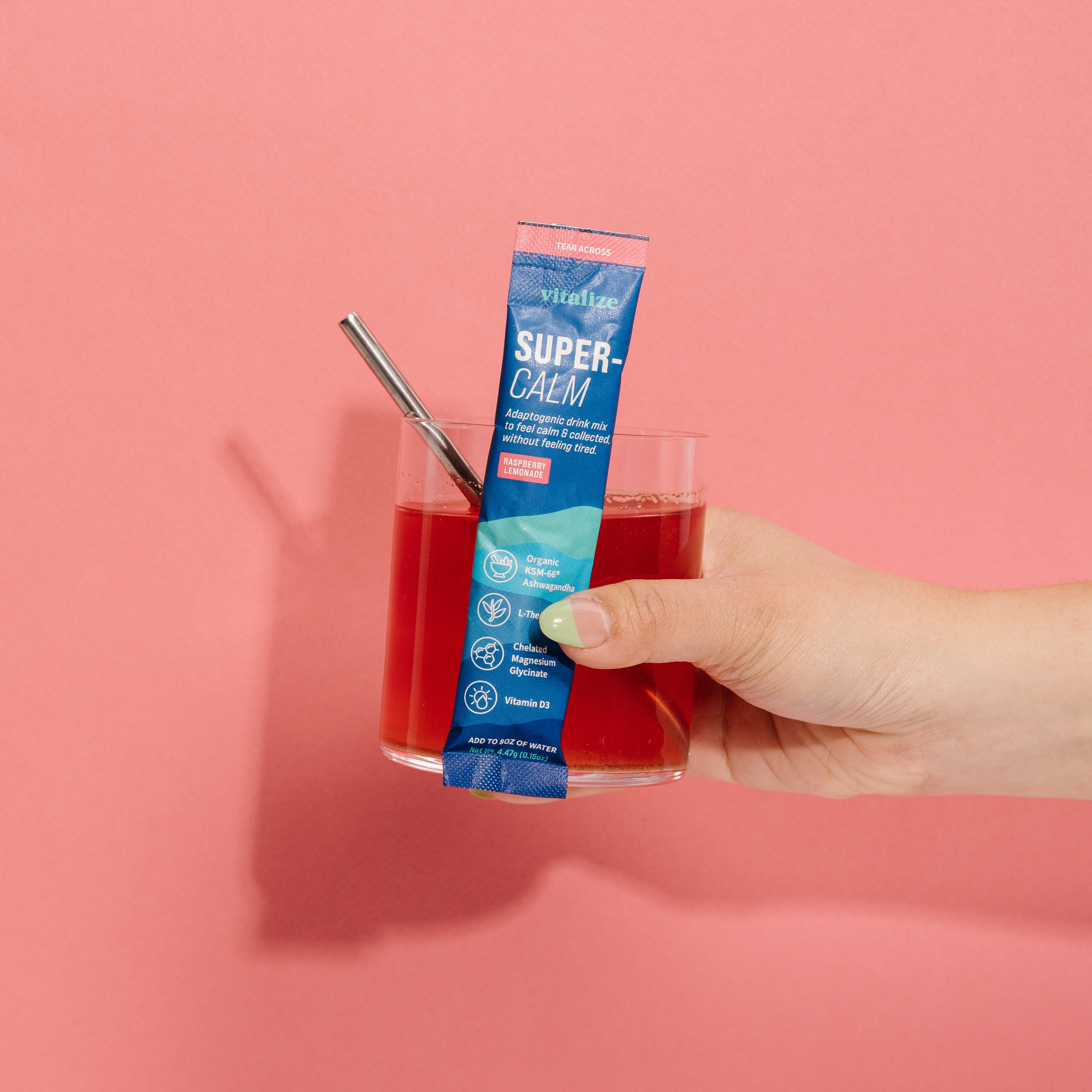
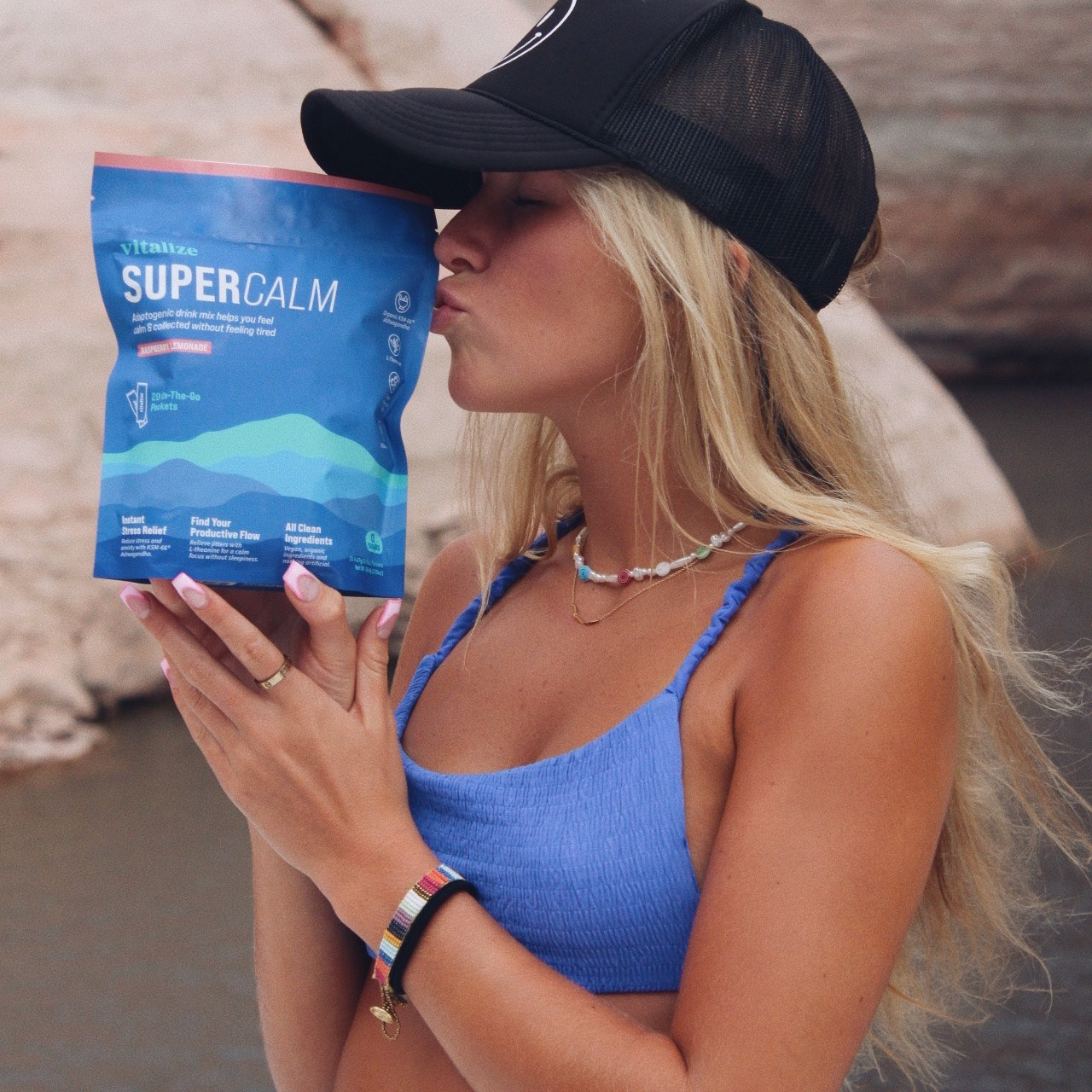
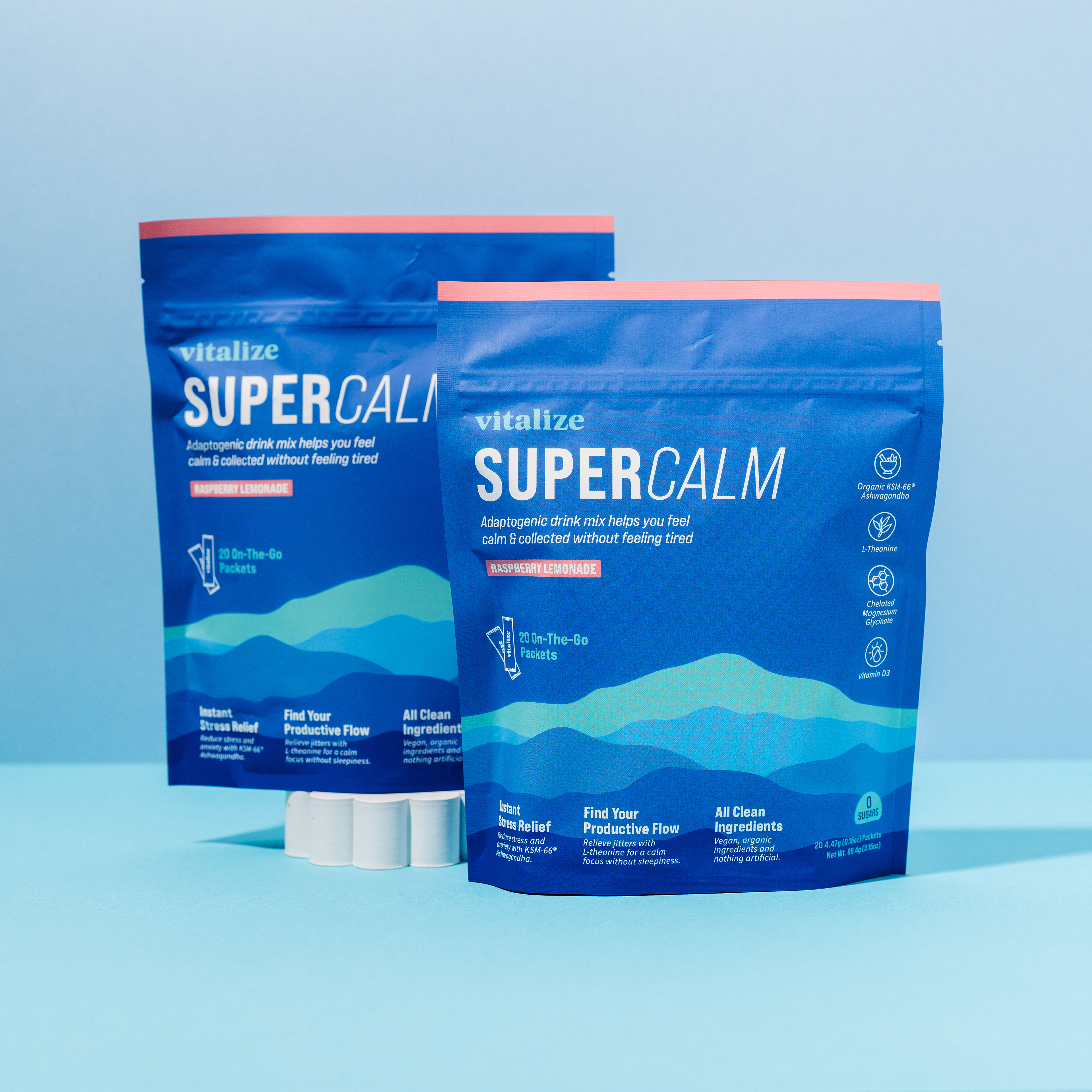
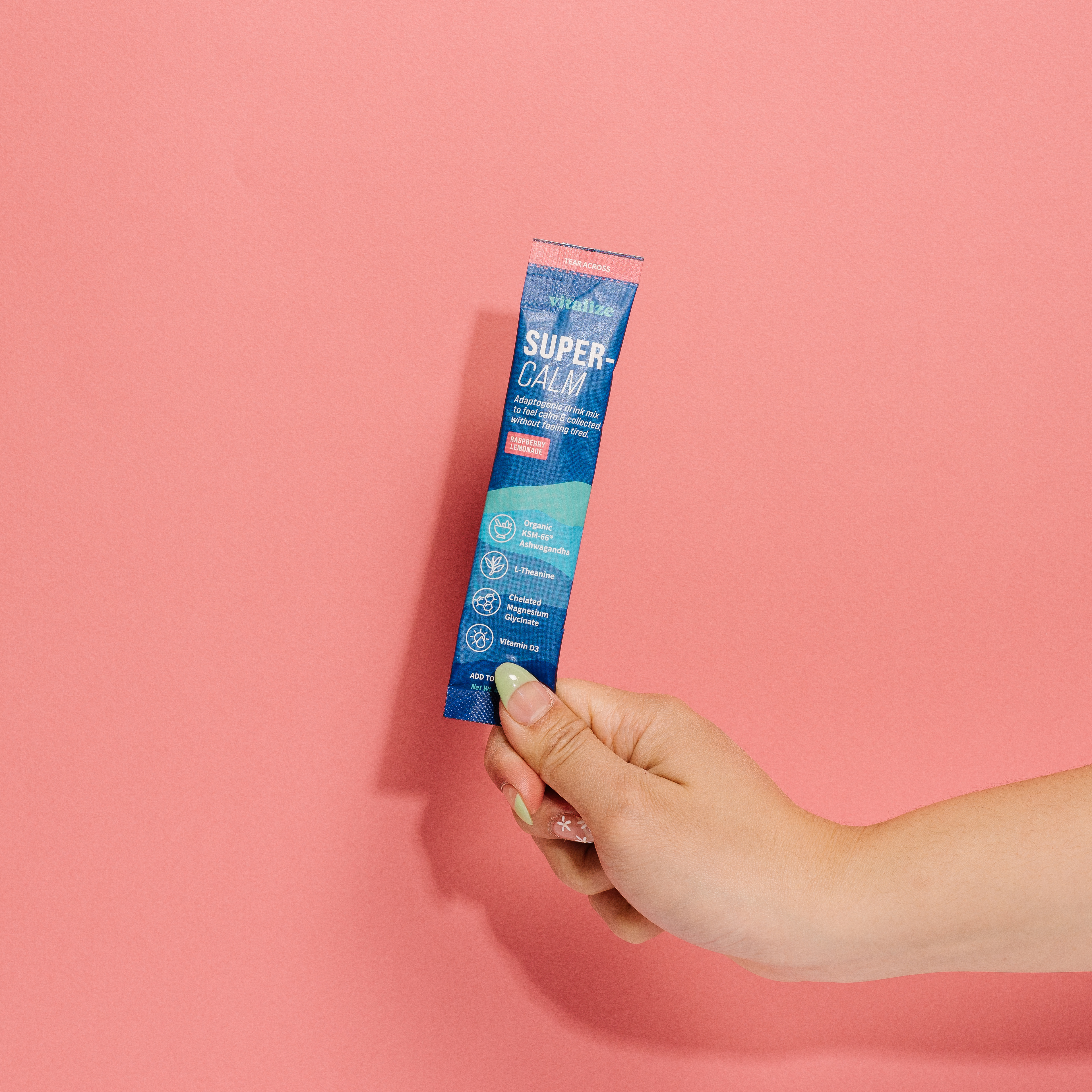
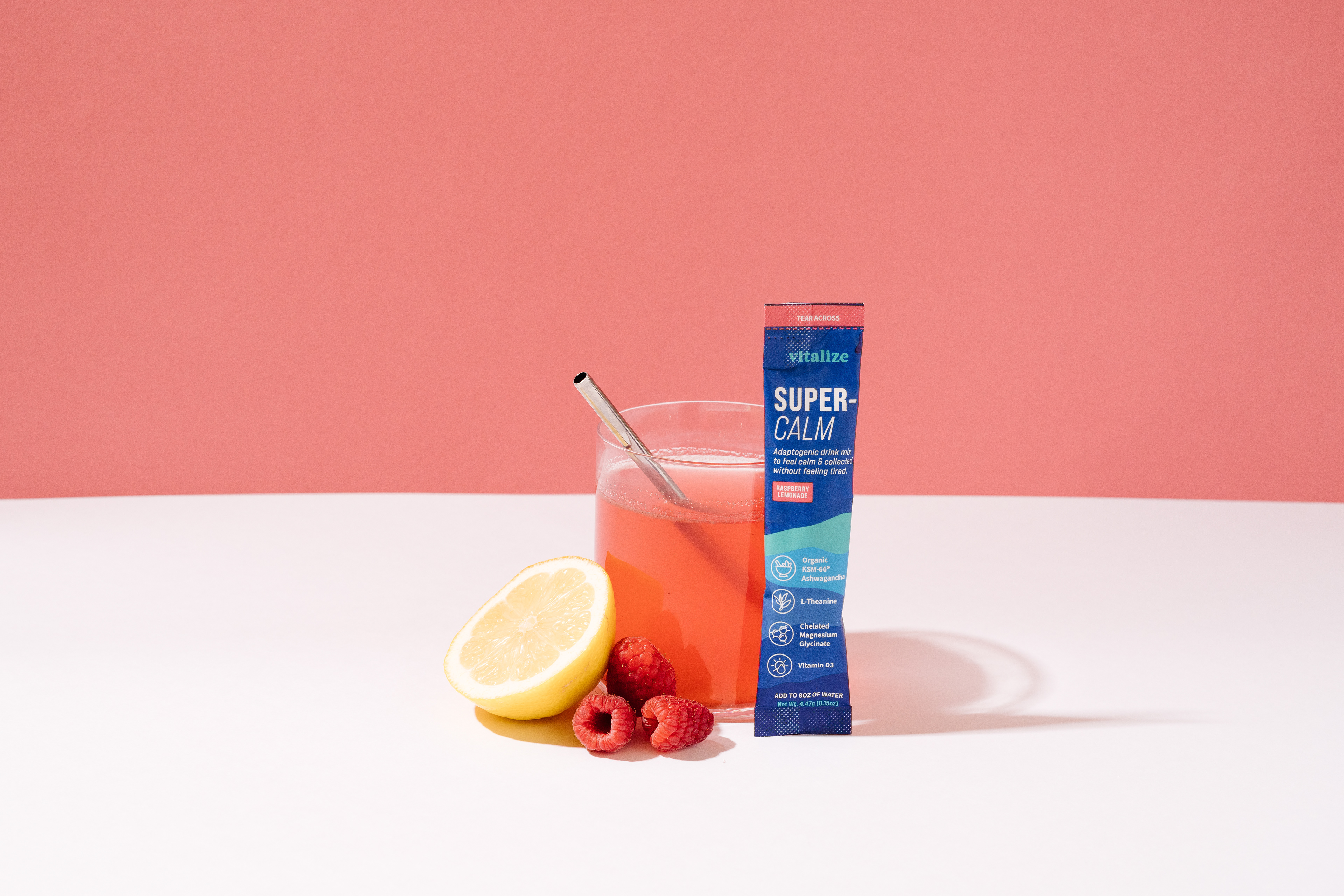
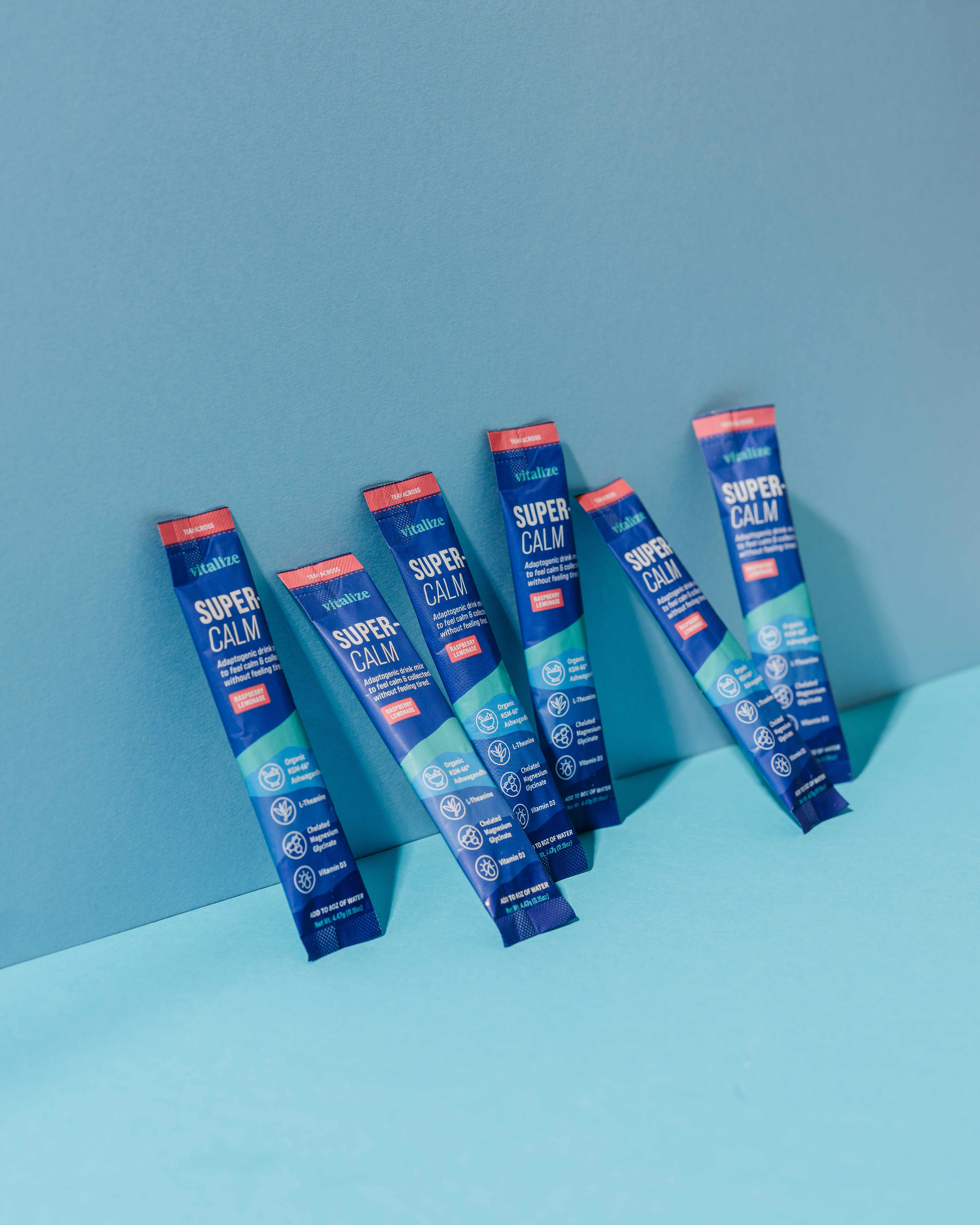
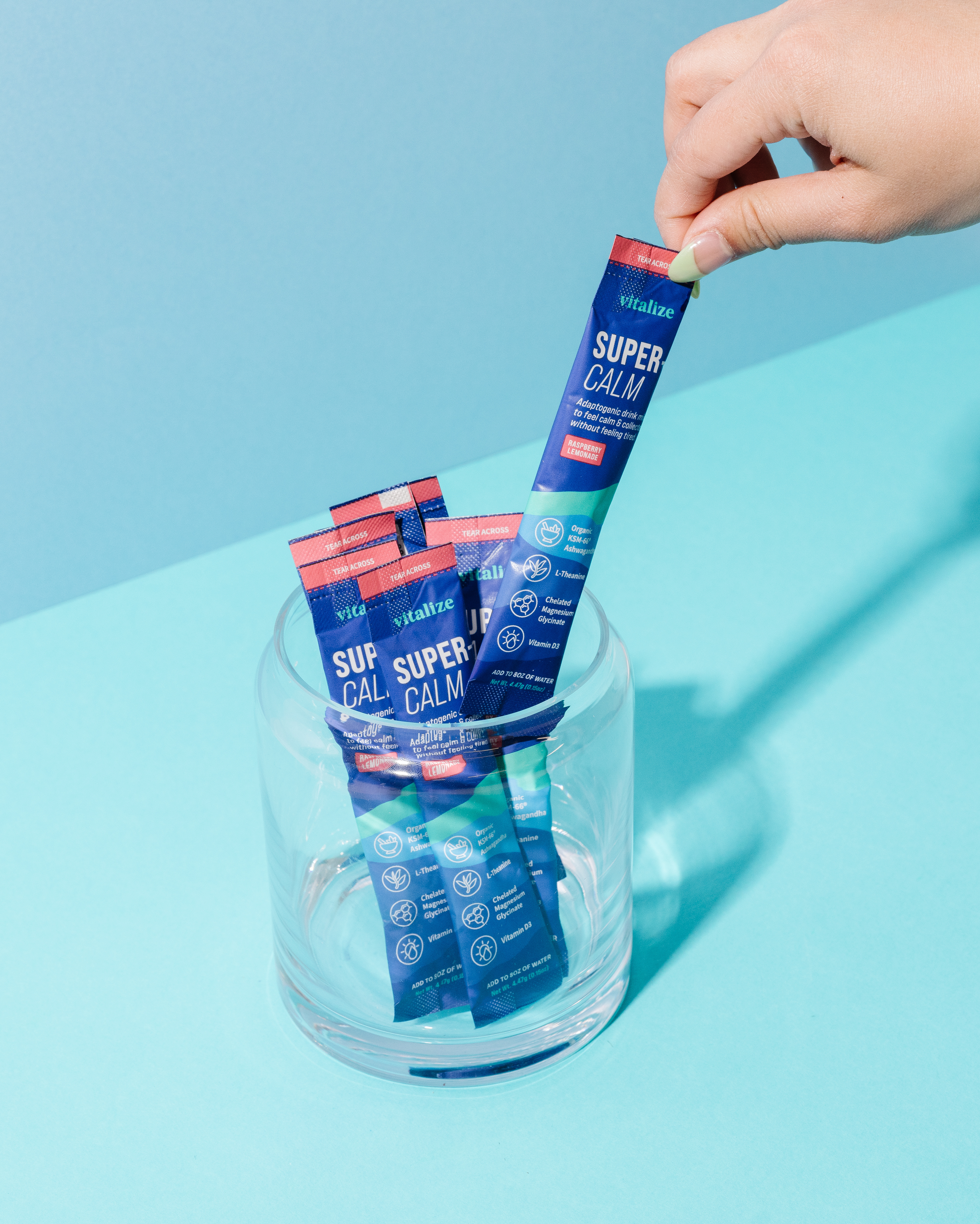
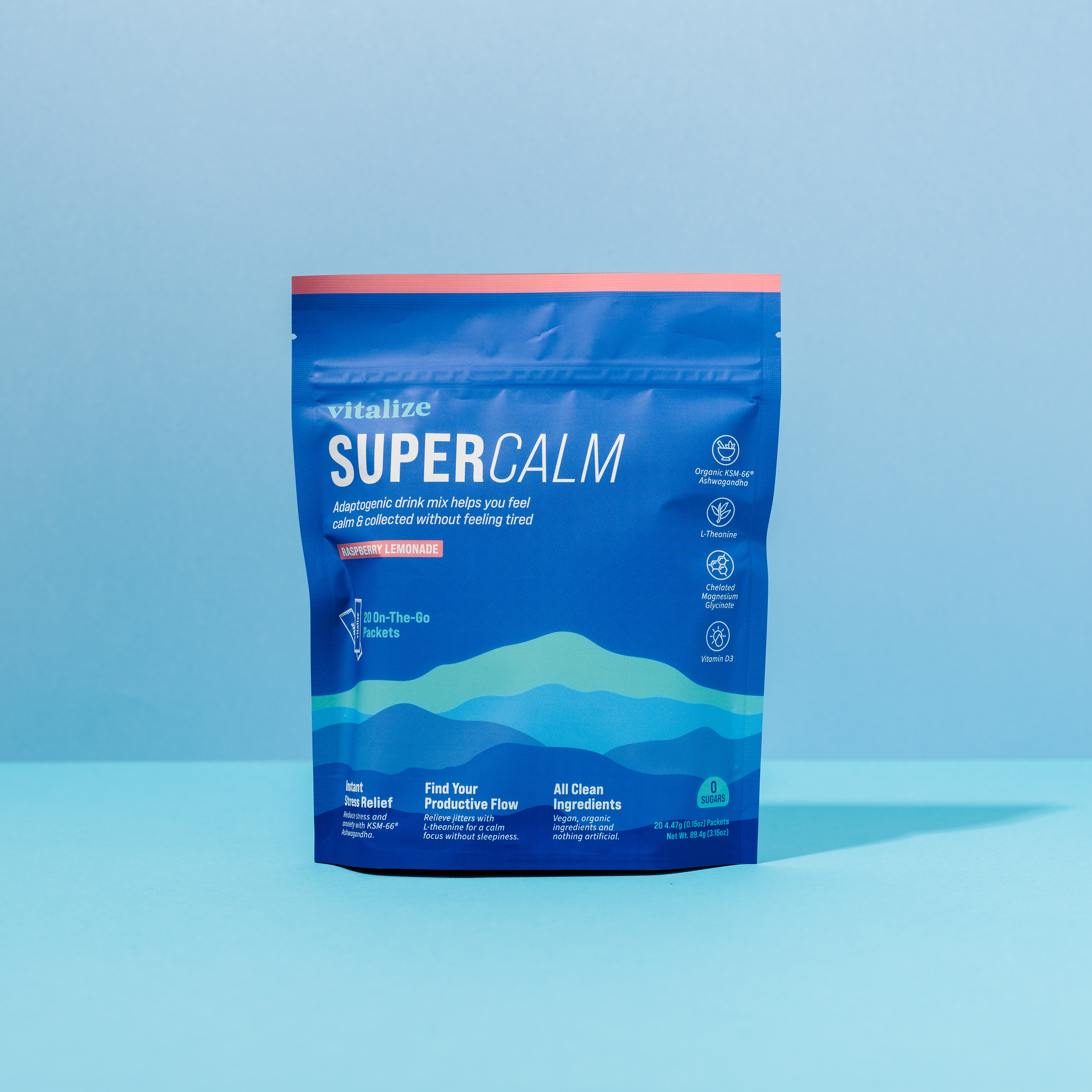
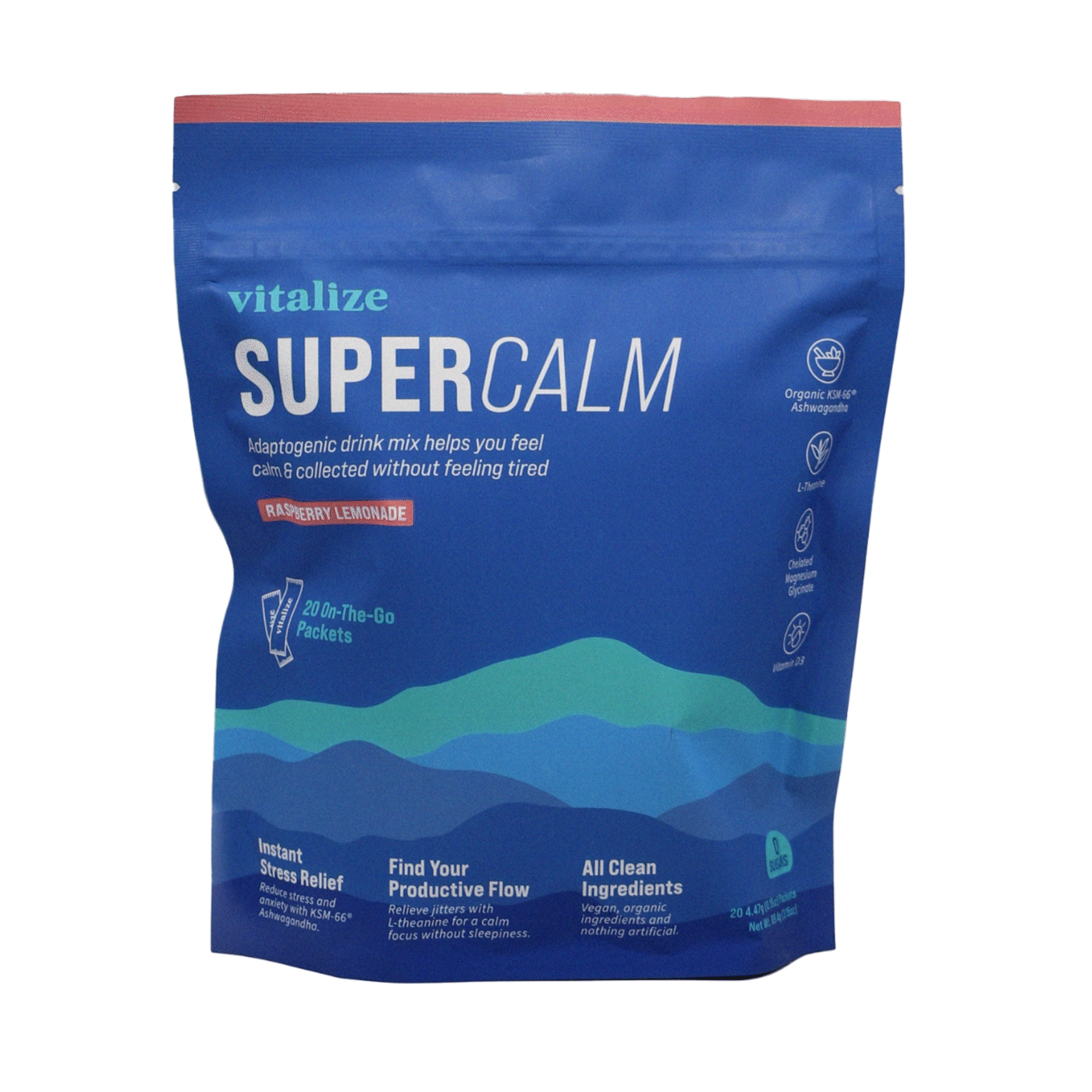
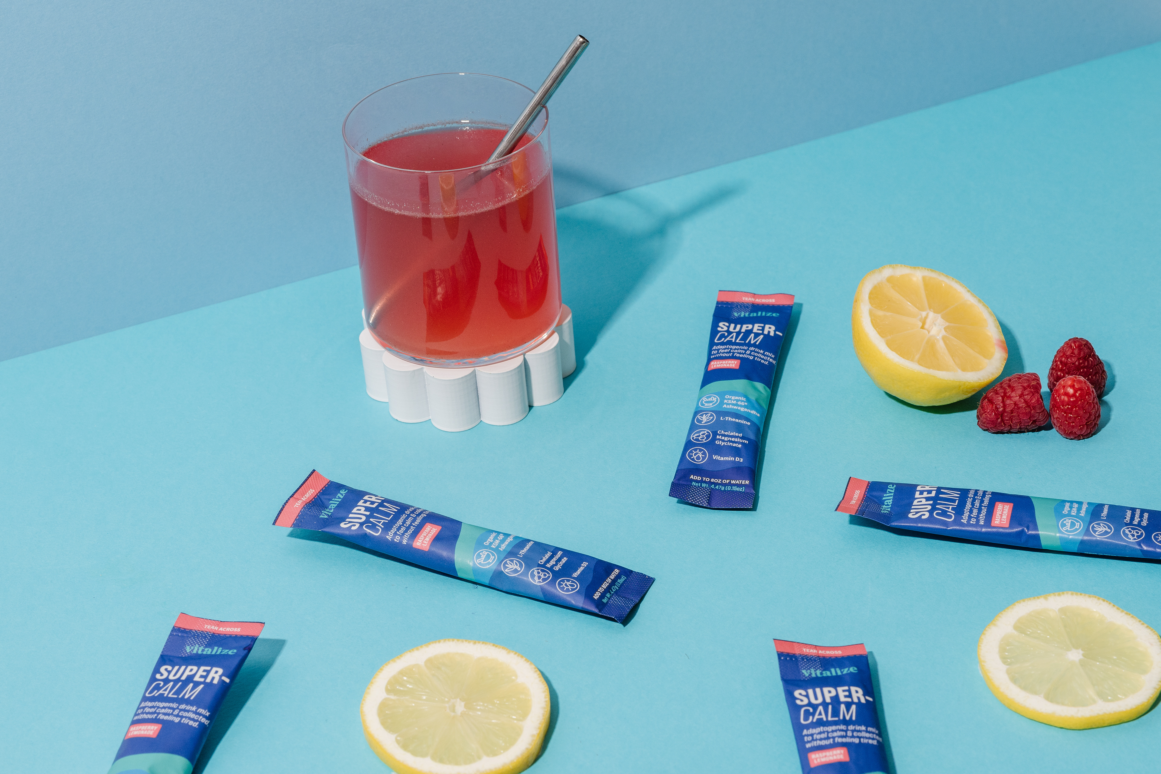
Product Imagery
(Courtesy of the Vitalize™ Team)
(Courtesy of the Vitalize™ Team)